[Case Study] Apartment Understated Elegance
Type: Open-living Space, 70.48m2
Location: Basel-Landschaft, Switzerland
Scope of Work: Full-Service Interior Design, Furnishing Suggestion, and Styling
Year: 2022-2023
Photography: Anastasia Karpenko
Apartment
understated elegance
CLIENT STORY
Our client, a family with two teenagers who love to cook and bake, invite people and entertain, engage in sports, enjoy leisurely mornings on weekends, and have a passion for travel wanted to revamp the entire ambiance of their open living space.
I want to create a space for cooking and entertaining, looking to change almost all the furniture and the color scheme. I envision a room that is harmonious, more practical, and less cluttered. I want it to feel very modern and different from now. I’m willing to invest in upscale items to give a sense of luxury to the room.
Although the client had a clear vision, the family was very busy, and she didn’t have the time or the ideas of how to bring everything together.
I believe that the ideas and experience of professionals are exactly what I need to elevate my home. I enjoy watching various interior design shows on TV/Netflix and appreciate the difference an interior designer can make.
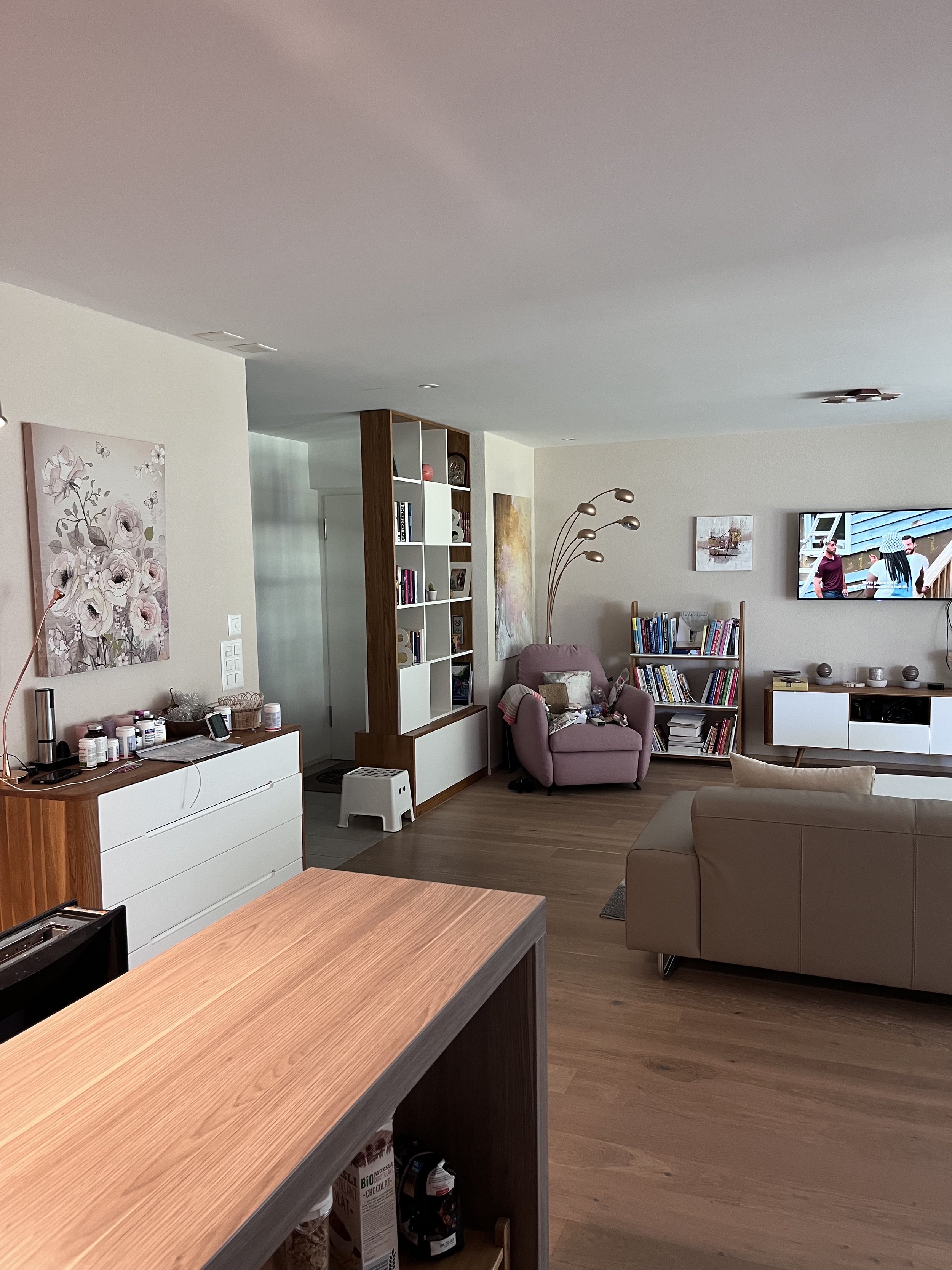
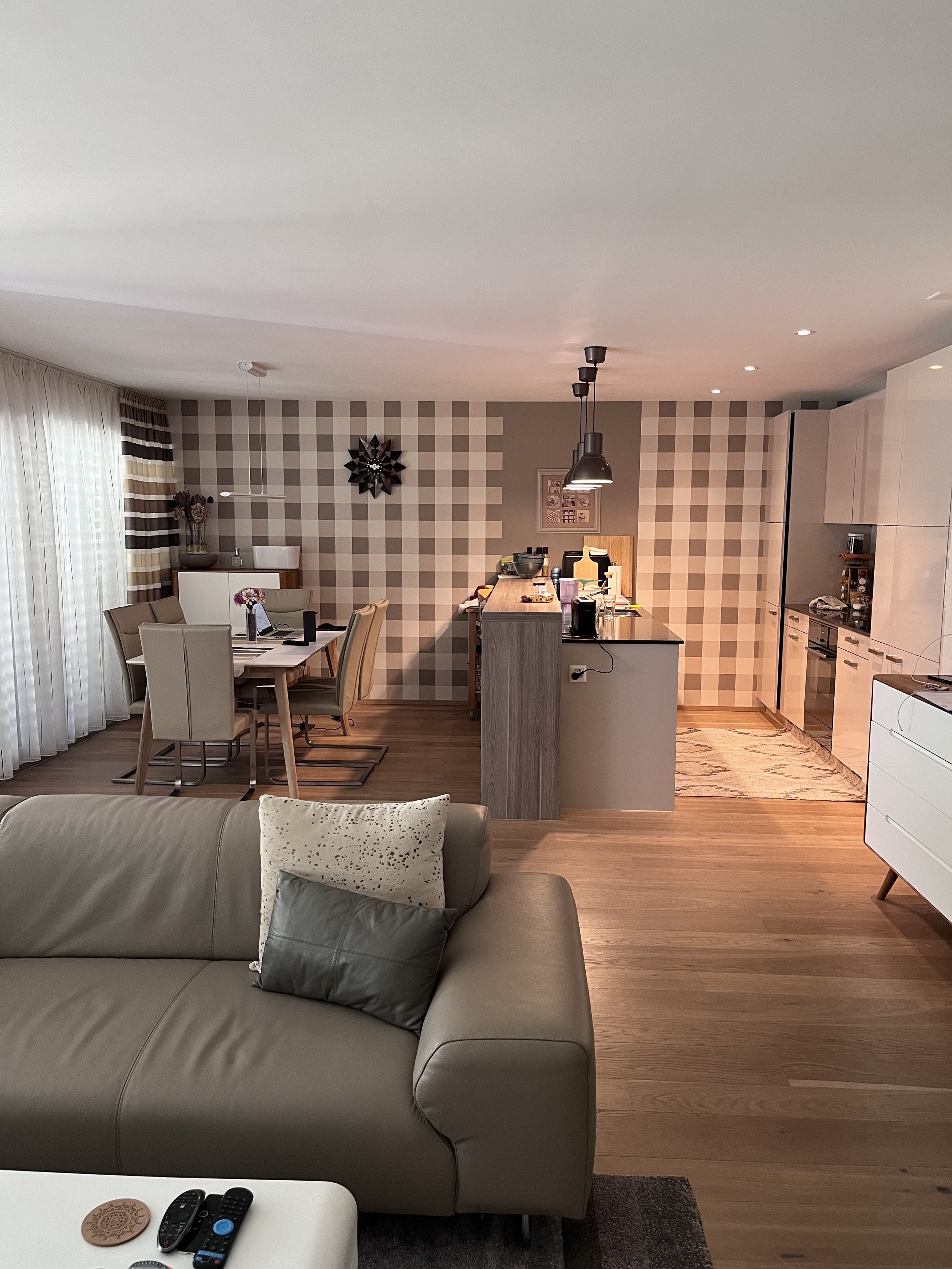
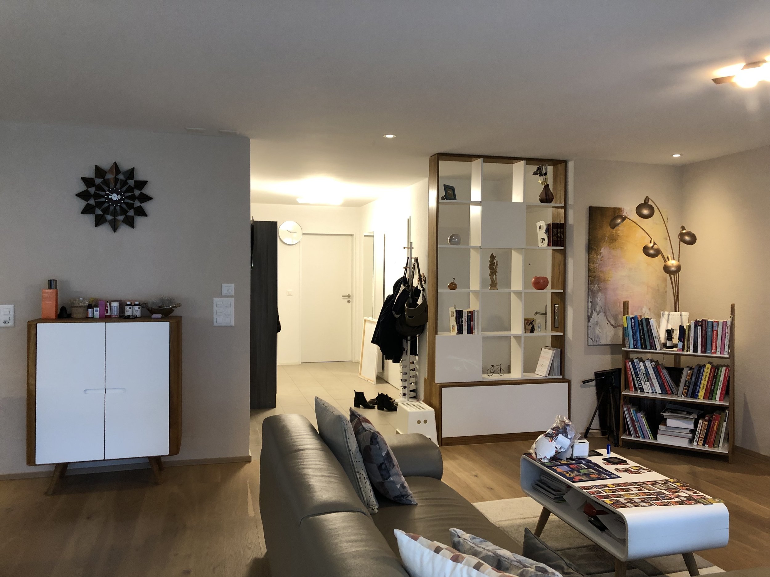
The client favored the current room color palette and wallpaper features, but she was tired of the existing style after seven years in the same living environment. Additionally, we discovered that the apartment didn’t support the family’s lifestyle well, and the storage was insufficient.
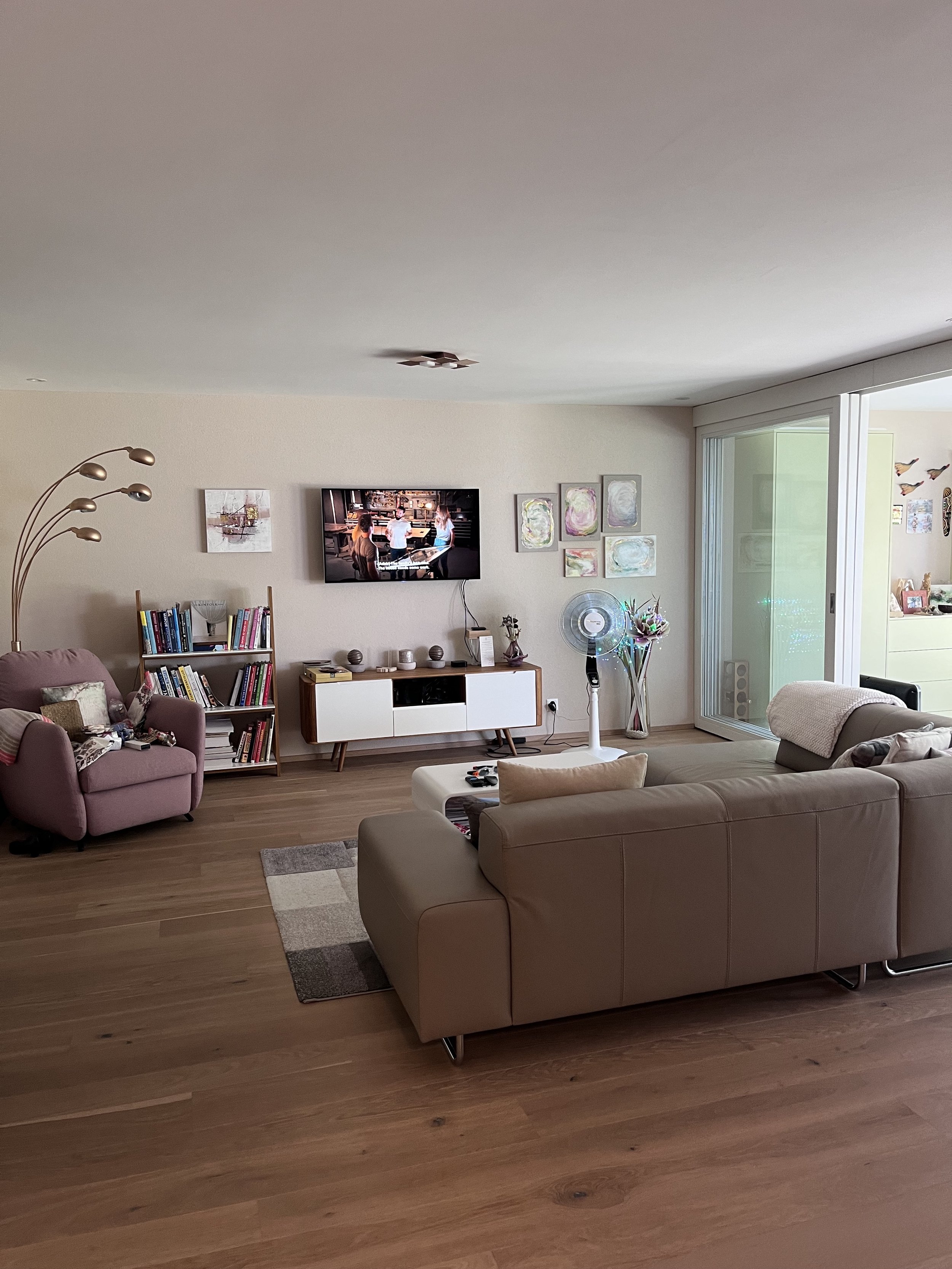
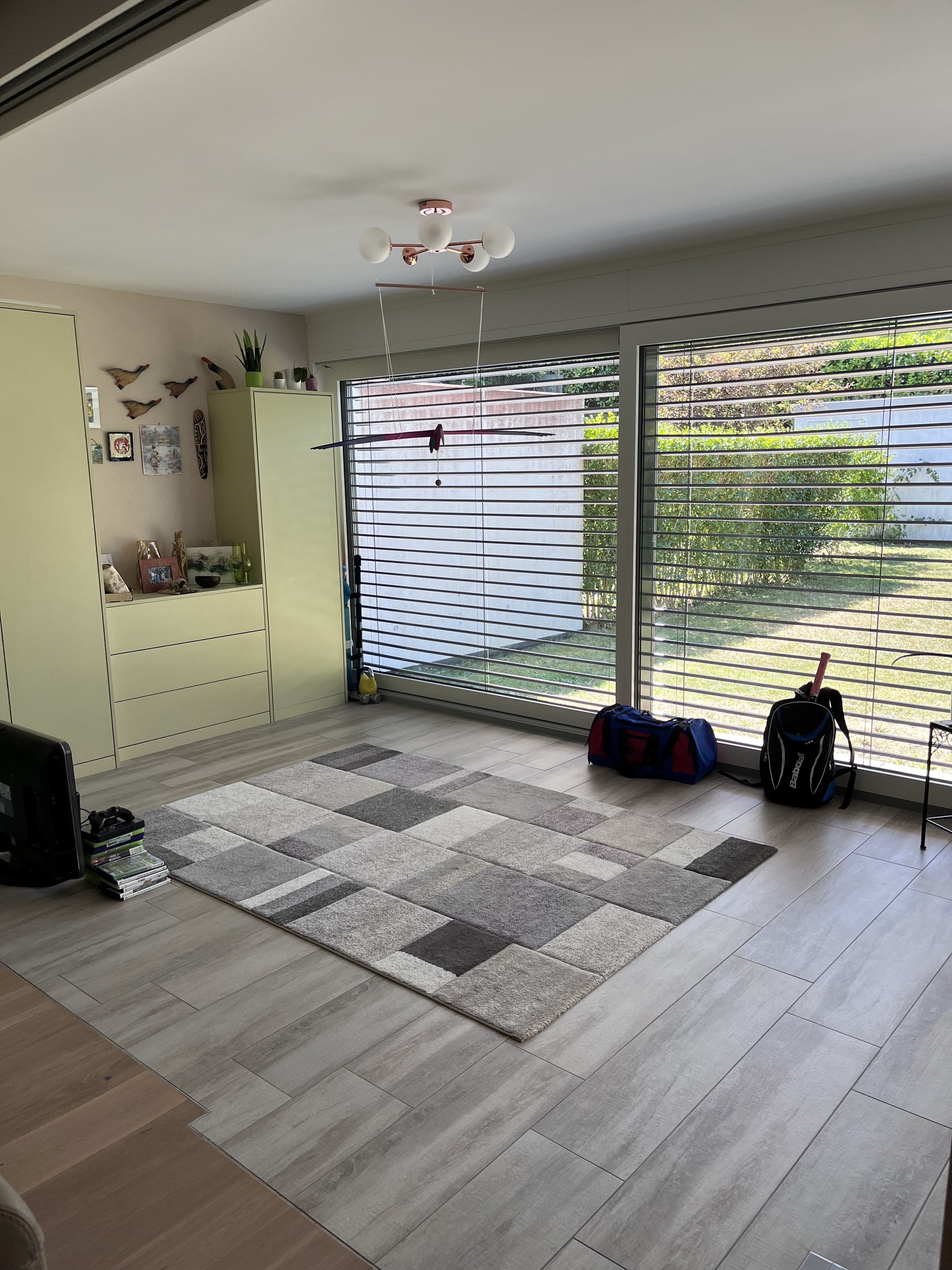
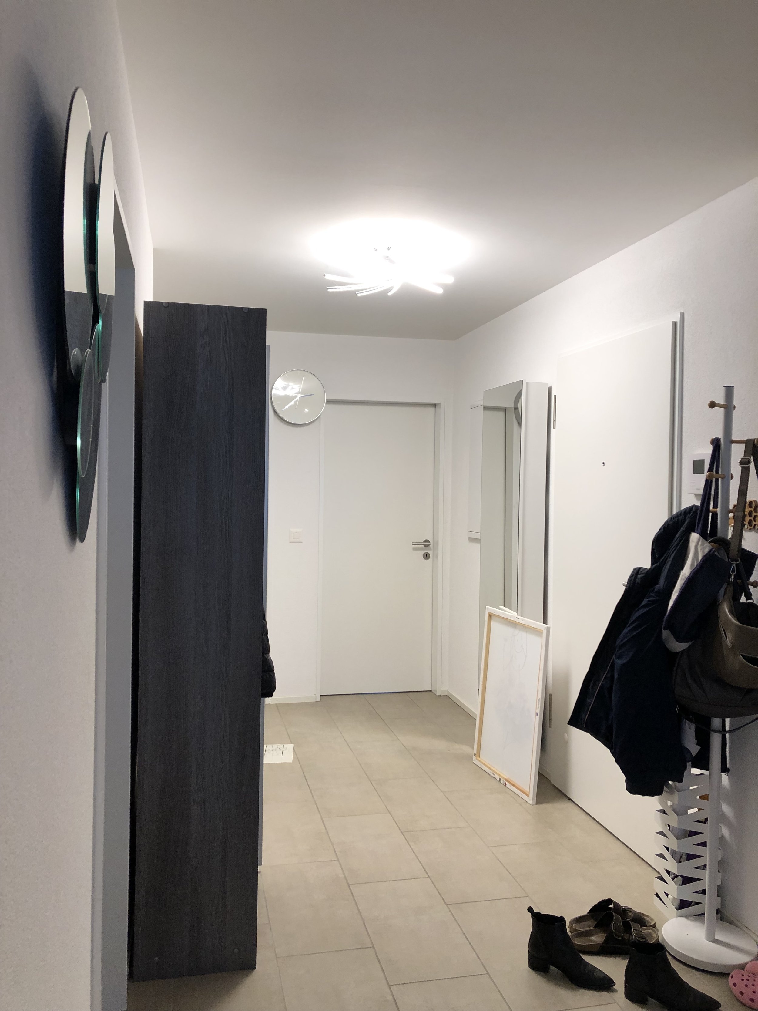
The space feels cluttered, lacks harmony between the entryway, living room and the wintergarden. There’s not a good use of space for storage, and the TV wall is bland and impractical. The Wintergarden is not properly used.
Therefore, we aimed to find a fresh overall design scheme, implement proper storage solutions, and redefine the room’s functions.
Initially, the client didn’t plan to change the kitchen, but upon discovering the potential to enhance the apartment's alignment with the family’s current lifestyle and improve storage, we decided to alter the kitchen layout. This included increasing storage throughout the entire apartment, incorporating modular and built-in furniture in the living area and entrance.
BEFORE
DESIGN APPROACH
Given the limited natural light in the overall apartment, we chose to embrace and enhance its cozy atmosphere instead of fighting against its darker nature. Every wall was painted in a light-mid warm grey tone, creating a comforting ambiance that is further accentuated by the use of copper and brass. These warm tones contribute to an overall inviting and snug feel in the space.
I like the Scandinavian style but with a more modern look, not so much into the cozy wintern style. I would not say I am a minimalist, but I definitely do not like cluttered spaces and many knickknacks lying around. I like to have accent pieces/walls in the room and overall would prefer to have a more unique look with spaces and pieces of furniture which help me maximise the use of space we have.
We established the concept of NEW URBAN LIVING, seamlessly blending modern design with understated elegance. This choice reflects the client’s preference, as they lean towards city living and thoroughly enjoy city tourism. The overall goal in our design approach was to achieve a more elevated look and feel.
The apartment was renovated seven years ago, so we wanted to keep features such as flooring, architectural elements, and large furniture.
We often will invite people at least 2 times a month (on Saturday evenings). We typically 1 family with or without kids; I like to start with cocktails, followed by dinner, and then we sit around the table. There’s not enough space for apero-type stand up chit-chat.
Furthermore, we aimed to create different entertaining scenes such as dining, seating and chatting in the sofa area, and having cocktail time in the winter garden.
FLOORPLAN
DESIGN INSPIRATIONS
Give some contrast, Mid-tones (perfect for a dark space), Layer styles & times, Bring some patinas (raw materials & vintage pieces), Pay attention to details, Diverse light sources
〰️
Give some contrast, Mid-tones (perfect for a dark space), Layer styles & times, Bring some patinas (raw materials & vintage pieces), Pay attention to details, Diverse light sources 〰️
KITCHEN/DINING AREA
The client expressed specific storage needs, including space for cooking/baking equipment, various dining sets used for entertaining guests, and backdrops and photography items, given her enthusiasm for food photography. Moreover, the absence of a pantry for the four-person family led to scattered food ingredients and health supplements.
Despite the client's initial preference to preserve the existing kitchen, we introduced new design ideas that focused on maximizing storage and enhancing visual appeal. Recognizing the potential benefits, the client ultimately chose a complete kitchen makeover.
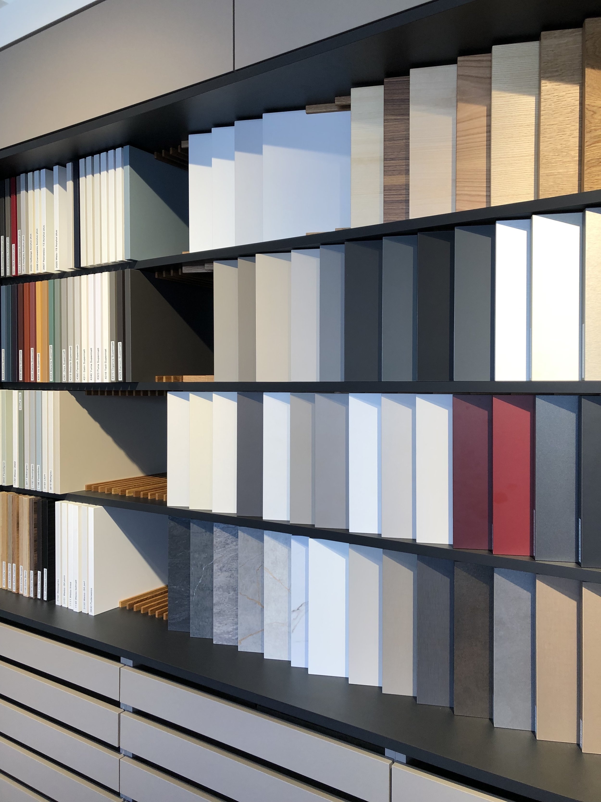
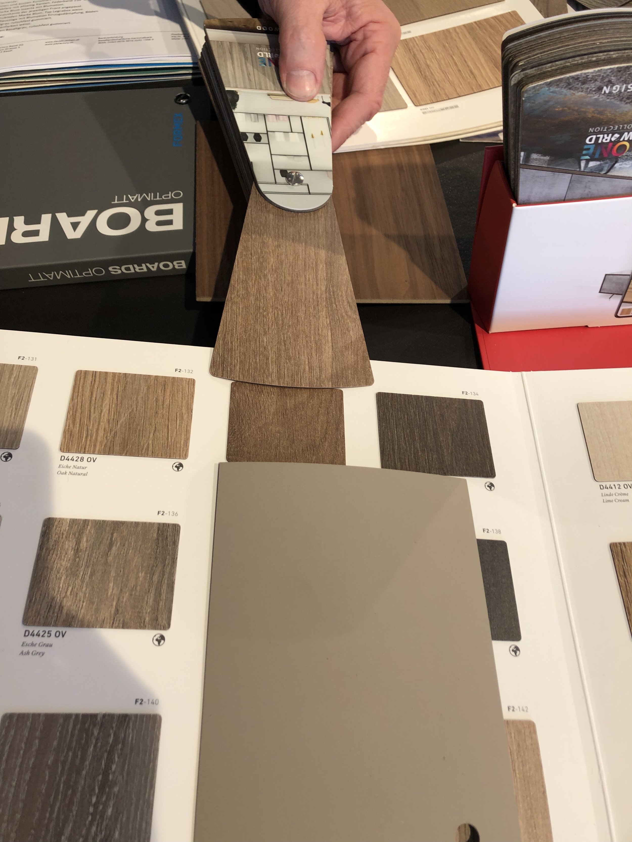
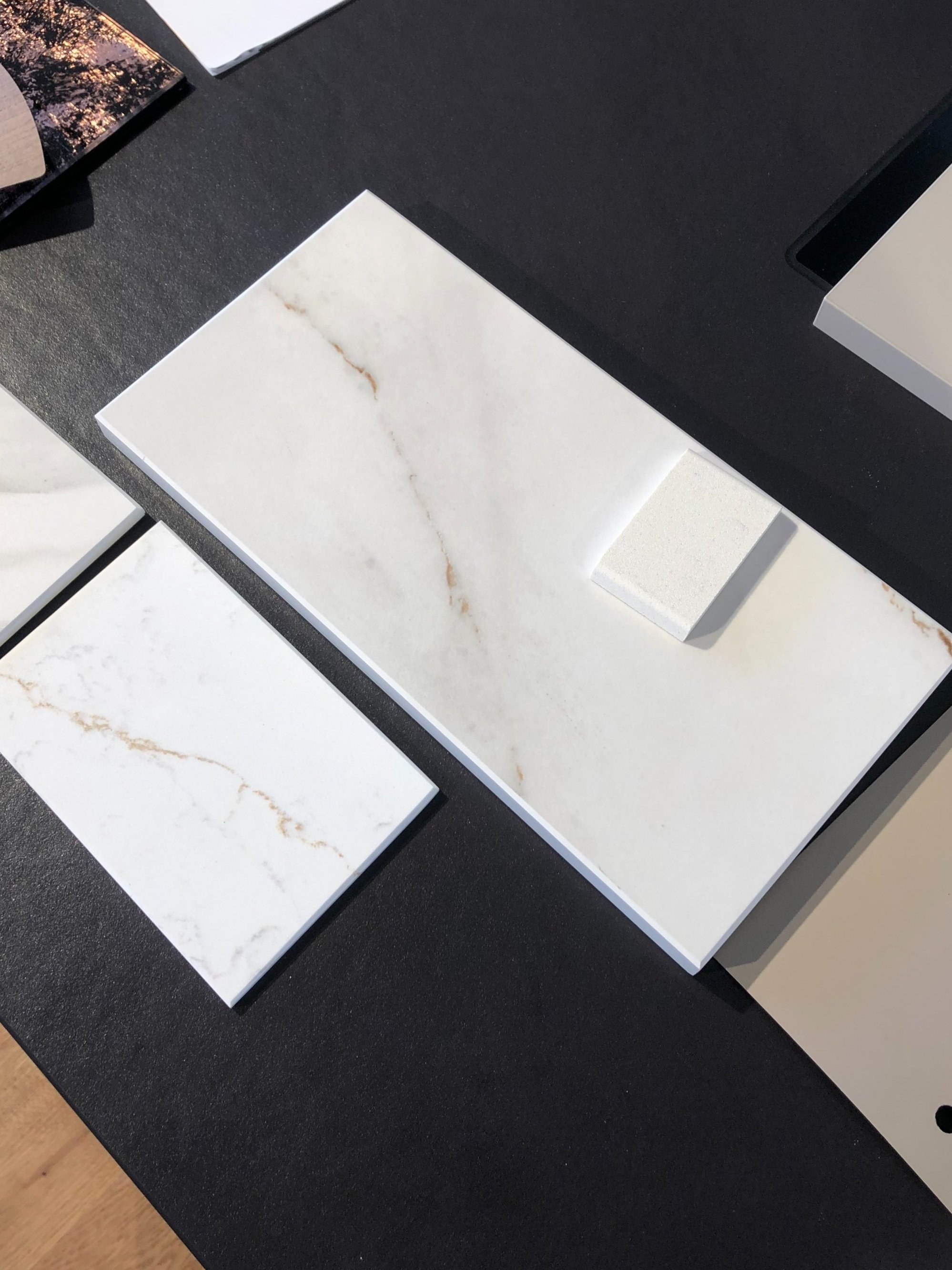
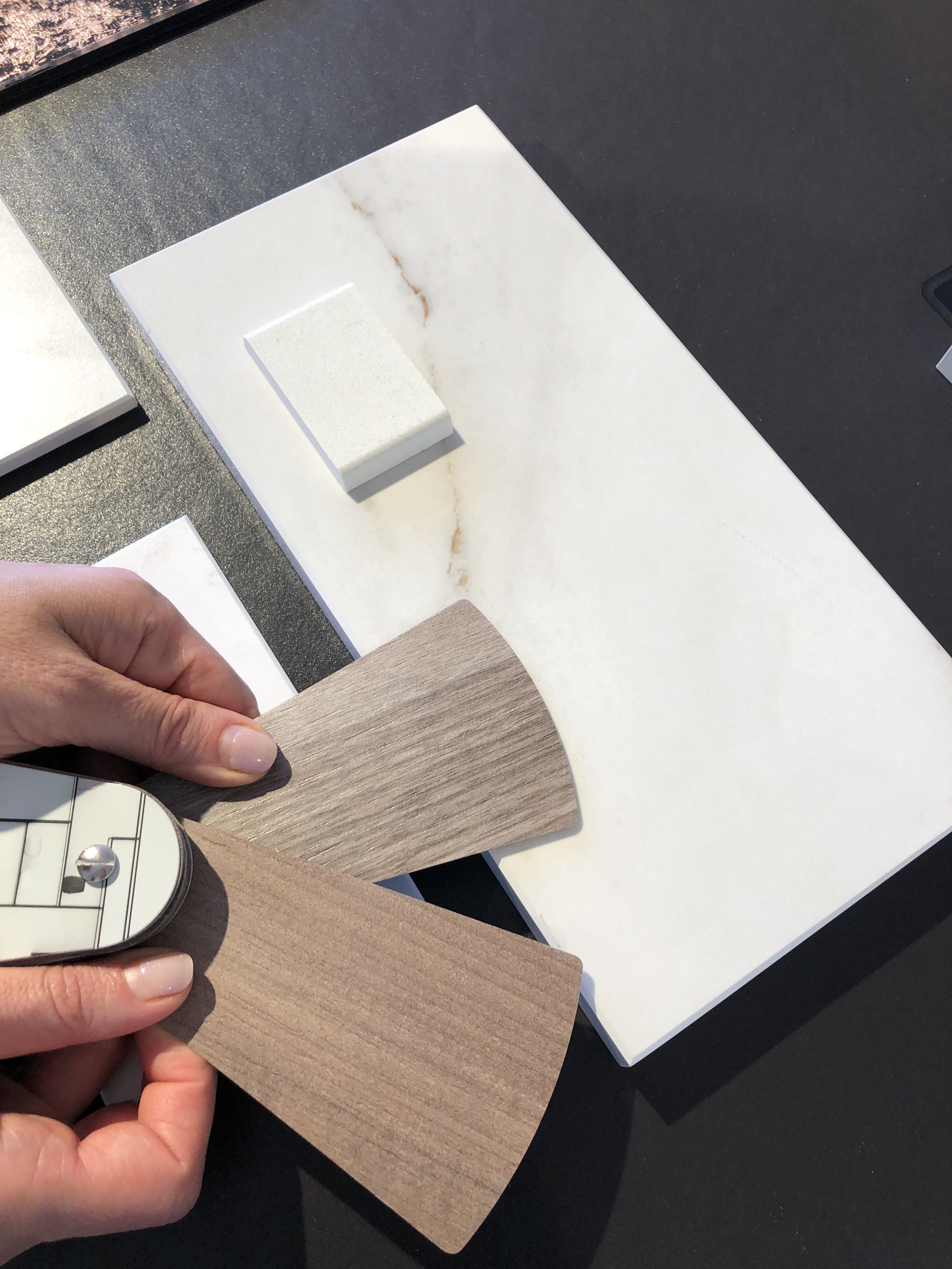
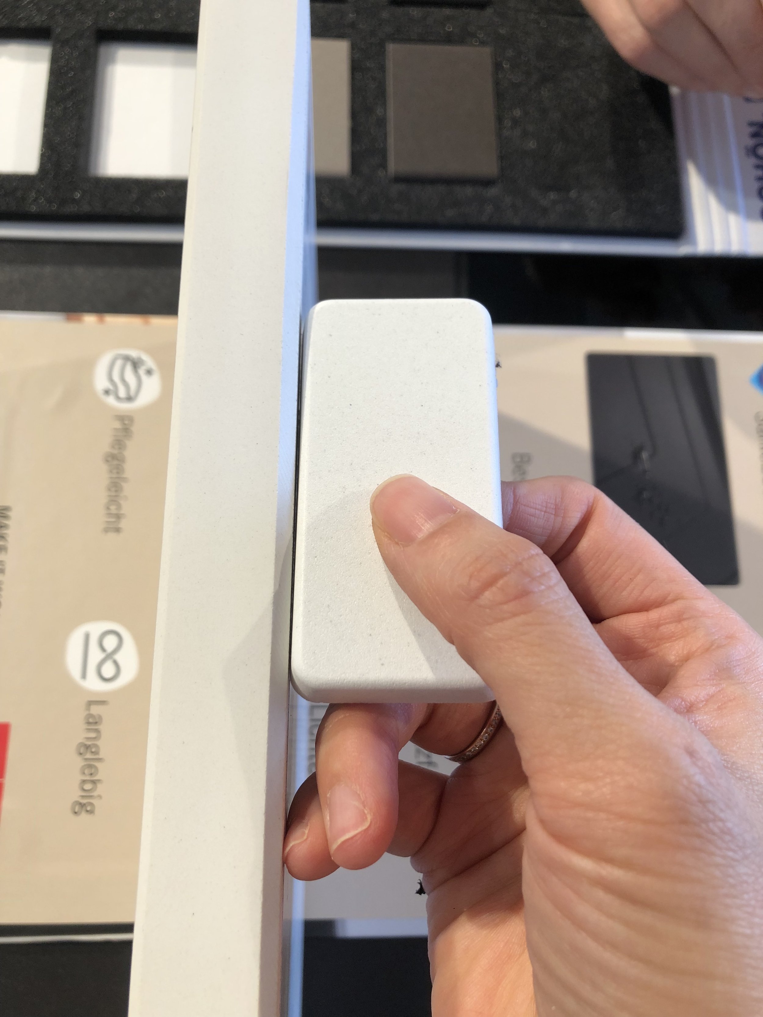
The Supermat Greige and subtle white marble optical surface serve as the primary colors and materials, complemented by accents of walnut, bronze glass, and brass/copper details in the kitchen. Additionally, a ribbed panel above the open shelving introduces a unique yet subtle texture. To enhance cohesion, we often use the same surface for the worktop and backsplash, creating a harmonious and visually peaceful space.
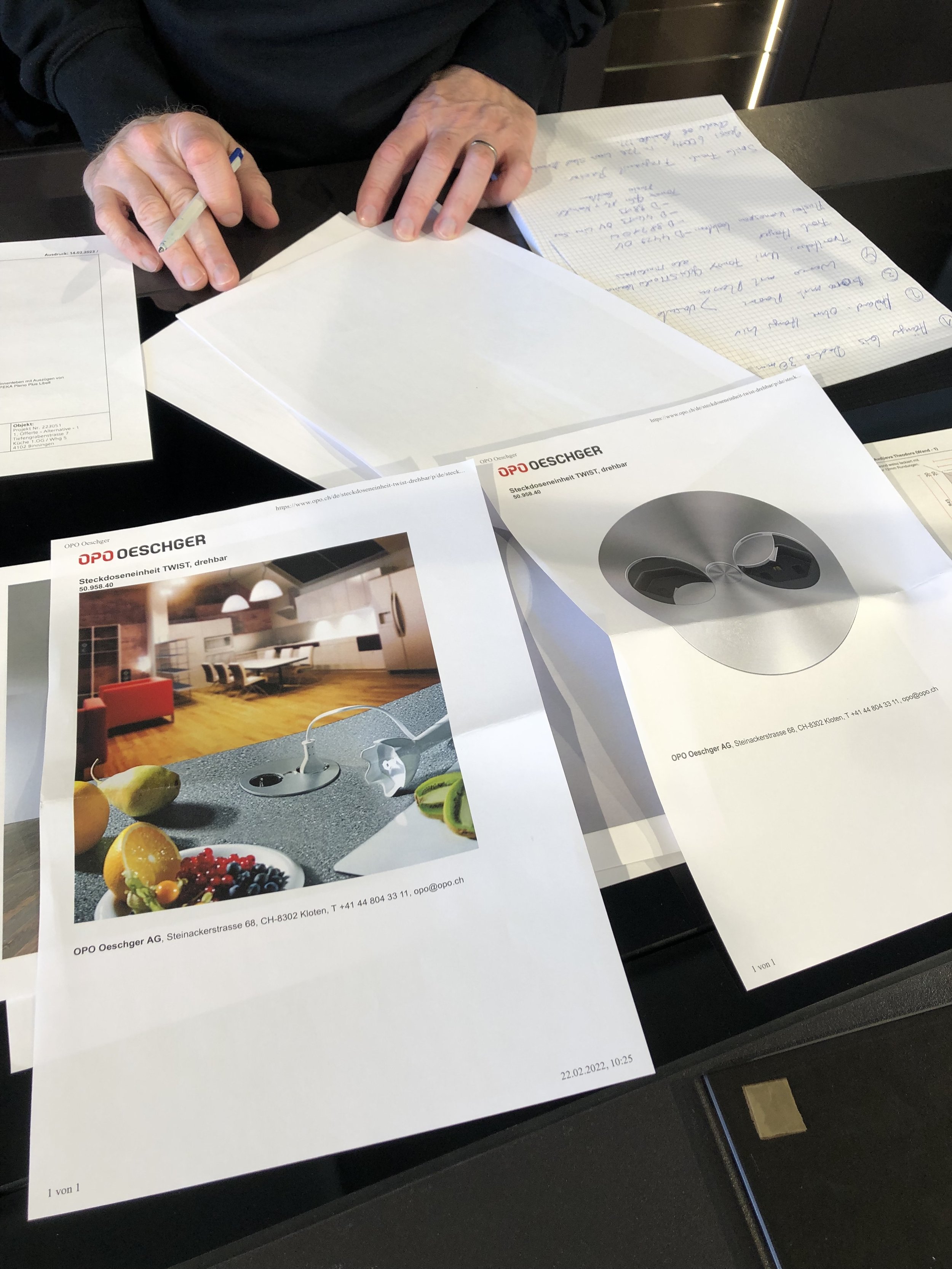
KITCHEN DESIGN PROCESS
Following the client's preferences, we optimized concealed storage units by extending a tall cabinet into the dining area and doubling the kitchen island for accessibility from both sides — both from the kitchen and dining area. Two tall cabinet units with double doors behind the dining table now serve as a pantry, efficiently accommodating groceries and kitchen equipment. This arrangement allows easy access to plates, breakfast items, supplement bottles, and more directly from the dining area, eliminating the need for the client to constantly move back and forth between the kitchen and dining space.
Additionally, we introduced open storage units combined with closed elements to showcase the liveliness and personality of the family. Incorporating breathable spaces like open shelving and glass cabinets enhances the overall design, providing both functionality and a personalized touch to the kitchen/dining area.
Instead of a traditional stainless steel sink, we installed a white stone sink to accentuate the exquisite copper faucet and dispenser, seamlessly blending with the countertop.
Moreover, we incorporated multiple lighting sources, including pendant lights, wall sconces, under-cabinet halogen lights, and LED lights inside the glass cabinet. This diverse array of lighting options allows the client to effortlessly control brightness and mood, enabling the creation of various lifestyle scenes in the kitchen/dining area.
LIVING ROOM
Our goal was to cultivate a more conversational atmosphere as the existing living room lacked cohesion and felt scattered with various small elements.
Understanding the family's keen interest in TV and its importance, and considering the client's feedback that the TV wall was bland and impractical, our focus shifted towards creating a focal point on the TV wall. The design incorporated a long unit featuring a tall bookshelf, providing enough space for storing the client’s cookbooks. Centering a larger TV and positioning it lower than the previous arrangement helped create a cozy seating setting. Additionally, we introduced softly lit lamps to the unit, contributing to a warm ambiance.
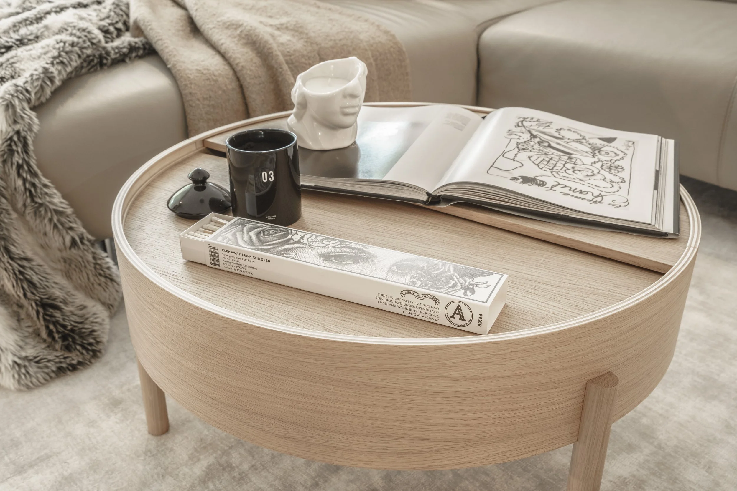
For the seating area, the client wanted to keep the sectional. Introducing a variety of cushions with different sizes, textures, and colors allowed us to refresh the existing furniture. For a more comfortable conversational atmosphere, we positioned the sectional, coffee table, lounge chair, and side table closely, anchoring them on the large area rug.
For the seating area, the client preferred to keep the sectional. Introducing a variety of cushions with different sizes, textures, and colors allowed us to refresh the existing furniture. To cultivate a more comfortable conversational atmosphere, we strategically positioned the sectional, coffee table, lounge chair, and side table closely, anchoring them on the large area rug.
To prevent overcrowding, we incorporated closed storage spaces alongside the open bookshelf. Additionally, two floating shelves with rounded corners soften the space and serve as a platform for displaying personal decor pieces, pictures, and more.
The light-weight console table positioned between the kitchen and living room serves as a transitional area, providing space to showcase art pieces, lighting, books, flowers, and additional decor items. Underneath the console table, a basket can be placed for extra blankets and cushions or even for a market basket, without taking up extra space.
WINTER GARDEN
The winter garden was underutilized, prompting the idea to transform it into a mini bar and cocktail seating area with individual swivel chairs. Despite deciding to retain the existing built-in unit for its miscellaneous storage, we introduced new elements. These included a bronze mirror backsplash, two shelves with integrated lighting in the middle of the existing cabinet, effectively creating a chill home bar.
ENTRANCE
The primary focus was on incorporating proper hidden storage units that are both functional and aesthetically pleasing. We replaced the existing bookshelf with a new full-height cabinet immediately after the lift, utilizing a bronze mirror to visually extend the space and set an elegant tone. Within the cabinet, the client can store coats, shoes, bags, and more. We designed an open section to maintain a connection between the living room and the entrance, utilizing lift panels on both sides. From the living room, the panels are finished with the same material as the kitchen, ensuring a cohesive look.
To address the client's initial worry about blocking natural light with the built-in storage, we designed a custom linear lamp. This addition ensures the entrance is well-lit, and the black color adds a stylish accent.
In contrast to the built-in storage, a chest of drawers serves as a decorative piece, providing space for flowers, family pictures, and knick-knacks. A round mirror that functions both decoratively and functionally on the wall, creating a more poetic atmosphere. While the furniture is the same the client had, we changed the door color to match the overall color scheme.
CONCLUSION
In this project, we repurposed several large furniture pieces, such as the sectional, built-in cabinet, drawers, dining table, and chairs. Despite reusing these elements, our detail-oriented planning allowed us to achieve a fresh and transformed appearance. The careful placement of large volumes and well-thought wall designs contributes to an overall look that is more organized and refined. Additionally, maintaining consistency in materials across different areas cultivates a cohesive flow throughout the space. Finally, the thoughtful final styling serves to maximize the potential of the open living space, creating a sense of balance and harmony throughout.
“Now, it’s your turn. Are you looking to start your first home design project and feeling a bit uncertain?
Don’t worry. Let’s start a conversation!
Book your FREE discovery call to discuss your project’s vision and goals.””


